Before and after - organizing graphic space
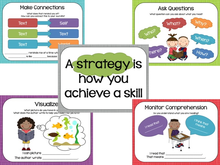
I found a graphic designed to help teach some reading strategies to help students use their metacognition while reading. As I teach my students these strategies, I thought it would be a good candidate to alter so that my students can have a visual model to help them remember the use of questioning, monitoring for meaning, making connections,
and visualizing.
When I first saw the image, it was not consistent with graphic space continuity. It lacked a cohesive border to bring
all four strategies together in the space. There was no foreground and background as the images seemed to overlap one another which was not pleasing to the eye.
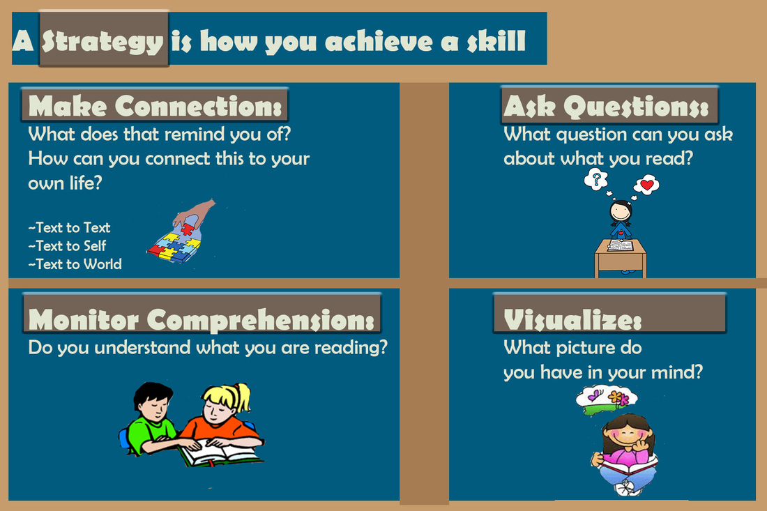
In addition, I tried to create more functional areas of the images by grouping them together in a consistent form. The
layout made the four ideas into a grid-like pattern that was more balanced. The four strategies were aligned with
each other and titles were placed to the left of each strategy with the idea that we read from left to right in mind.
and visualizing.
When I first saw the image, it was not consistent with graphic space continuity. It lacked a cohesive border to bring
all four strategies together in the space. There was no foreground and background as the images seemed to overlap one another which was not pleasing to the eye.
In addition, I tried to create more functional areas of the images by grouping them together in a consistent form. The
layout made the four ideas into a grid-like pattern that was more balanced. The four strategies were aligned with
each other and titles were placed to the left of each strategy with the idea that we read from left to right in mind.
Before image
after image
selecting and creating images
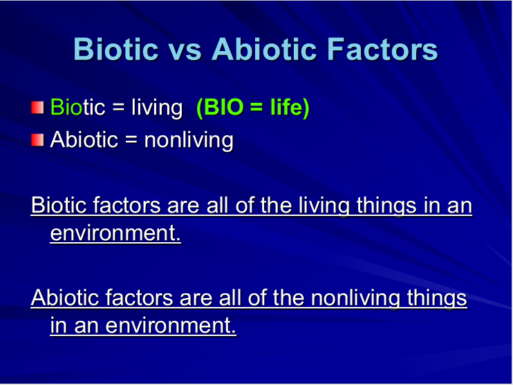
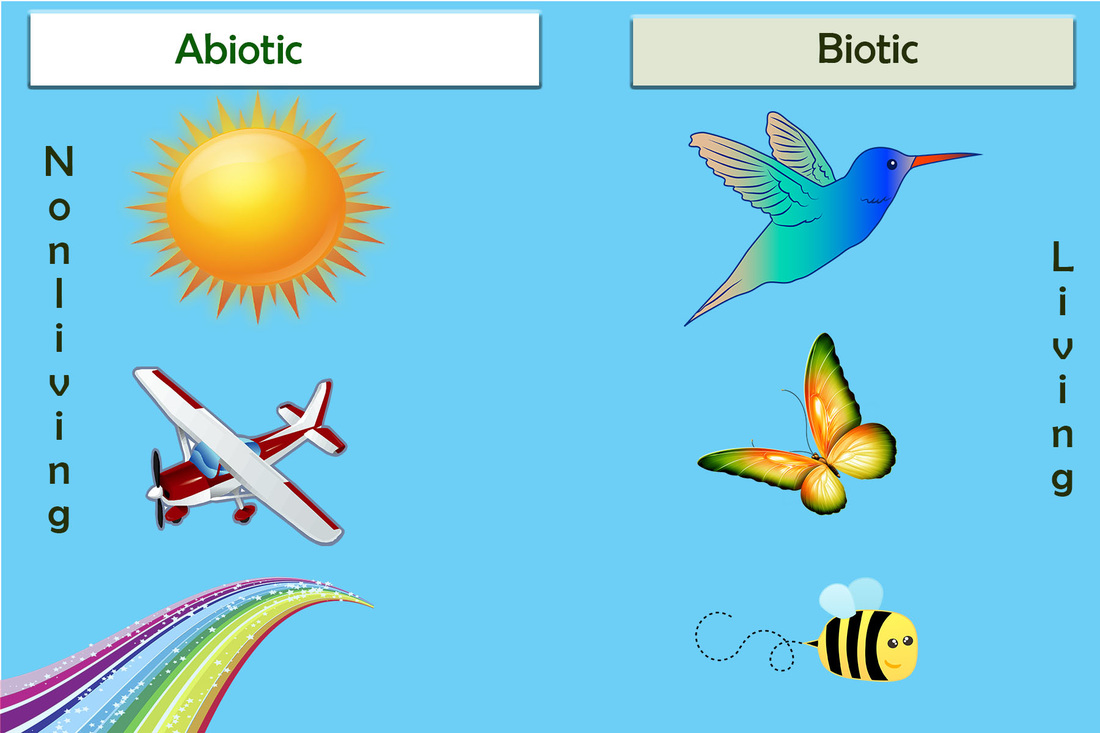
When selecting materials to be presented, they must be able to tell a story. I selected some illustrations that were
very realistic to include in my before and after images. I included shapes behind the text to give categories to the
information I was presenting. In addition, I wanted to have realism consistent with explaining the concept through my images and changed what was originally all words to a symmetrical layout of information that formed two columns.
The background I added was to allow the information presented to stand out and allow the viewer to depict meaning
without extraneous cognitive overload. Everything presented was consistently the same from it's placement to the
choice of information in one environment.
Before